
Type Tips is your first typographic guide.
Type Tips is a resource for non-designers or aspiring designers who are unfamiliar with typographic concepts. Topics include: basic terminology, choosing type, using type, and a brief introduction to page layout.
Readers are also exposed to the author’s voice and her undergraduate design work as it relates to the content. The author is the reader’s mentor. She guides readers through the learning process and applies the book’s concepts to the real world.
Typographic knowledge shouldn’t be available only to designers. Type Tips educates readers in a way that isn’t intimidating or overwhelming.
One resource, two versions.
Type Tips was created in two formats: in print and as an ebook app. Currently, only the print version is available. Click the button below to order your book from Lulu! If you have questions regarding a digital version, contact me.
The Process
My Vision
Typographic knowledge shouldn’t be available only to designers. With Type Tips: a Beginner’s Guide to Good Typography, my vision is to educate readers in a way that isn’t overwhelming.
Type Tips is primarily written for non-designers or complete beginners looking to enter the design field. Topics range from basic type mechanics, to how to choose a typeface, how to set paragraphs, and a brief introduction to page layout. Each subject provides foundational knowledge, but it doesn’t go so far into detail that it would discourage the reader.
Readers are also exposed to my voice as the author. At the bottom right corner of several pages, my voice appears, offering personal experiences and advice. There are also longer sections that expand upon this idea of offering the author’s personal experiences. My voice acts as the reader’s mentor that applies typographic concepts to the real world. Throughout the book, I also integrate examples of my undergraduate design work as it relates to the content.
Devising a Plan
When it comes to large projects and deadlines, I always have to have a plan of action. All seniors were required to create a schedule so that we could stay on track. Over winter break, I had already written and ordered all of my content, so that during the spring semester I could focus on design. My goal was to produce one section per week, so that I could have plenty of time for revisions and technical issues.
By completing most of my work at the beginning of the semester, it eliminates added stress as the semester ends. It also leaves plenty of time to edit and perfect my work.
Writing the Content
Because of this project’s scale, I started my research over winter break. I gathered six typography books, some I had purchased for school and others that my professor suggested. I read each book and made notes about what I found interesting and quotes I might want to reference.
From there, I structured an outline and wrote pages and pages of notes as I typed the content for each section. This process was lengthy, but it helped me get all my thoughts on paper and organize my information. Writing helps be flesh out ideas.
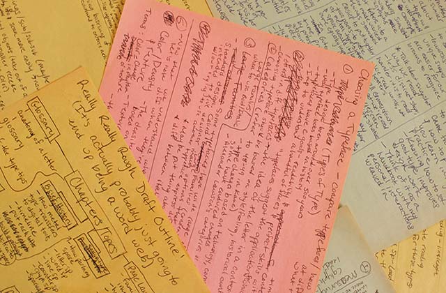
Pages and pages of notes! This exercise helped me organize my thoughts before I wrote my first draft of the copy text.
I broke my information into four sections: The Basics, Choosing Type, Using Type, and Intro to Layout. Some of these sections appear in other type textbooks and others do not, especially the section about choosing type. Usually, type textbooks do touch upon choosing the right typeface, but rarely do they dedicate an entire section to it.
My goal was to provide useful content in an order that makes the most sense. I left out anything too complex or unnecessary to obtain a basic typographic foundation.
Personal Experience: Our First Graphic Design IV Meeting
(Originally written Spring 2014) This week, we had our first Graphic Design VI class. I worked my butt off over break gathering information and writing all of my content and I was feeling pretty good about moving forward. My project involves sharing with others my love for typography and teaching good type skills to audiences who aren’t familiar with those concepts. The night before class, I put together a presentation of all my research, which serves as a detailed outline of what I’ve written and how I intend to present my information.
As a designer, I should know that nothing is ever right the first time. This was no exception. My classmates had reservations about my project being too similar to what’s already out there and I was challenged with making my project uniquely distinct from other type textbooks. I had already intended to do that by making my information far more concise, using an informal tone, and adding in personal accounts of my typographic inter-
actions. However, there still needed to be more distinction.
One of my classmates suggested adding an interactive element for e-readers or tablets. To compliment my print work, I could create in interactive PDF that includes hyperlinks, page transitions, and other interactive elements that could add another layer to the learning and reading experience. Sure, it’s more work, but if this part strengthens my project, I’m more than happy to put in the extra hours!
As a first assignment, my entire class has to create a mind map of our project. Even though I know my project pretty well, this gives me an opportunity to step back and really assess my design intent. I find that sometimes I just want to go, go, go when I have a plan. But it’s important to step back and reaffirm that your course of action is the best possible design solution.
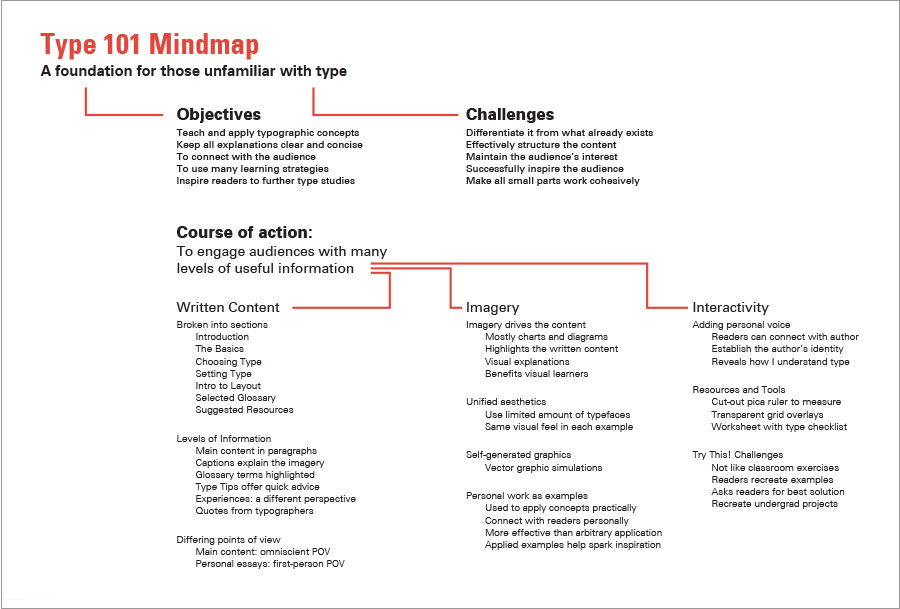
Stepping Back
The mindmap really opened my eyes. It helped me reaffirm my project’s intent. Sure, this project was something I wanted to do, but I needed to discover how I could make it something other people would want to read.
The mind map also helped me reestablish my target audience. At first, I was leaning toward designing for the future graphic designers, but in critique, my professor and classmates thought that even the common person could benefit from this information. Even though there’s tons of resources out there, they’re usually written with the assumption that the audience is either a designer or has some typographic background. With my project, I hope to present my information in a fun, friendly manner that design students and non-designers alike could find useful.
This preliminary process might have seemed like I was stepping backwards at the time, but as I look back, I realize that it helped me focus. I wasn’t just writing this book for me, I was also writing it for my audience: the beginners. When designing pages, it’s imperative to keep the audience in mind because that’s what graphic designers have to do when working with clients.
After the first week in class, I knew I had two design challenges. First, I had to establish an exciting design to keep my audience engaged. With this design and the way I handled my content, I could ensure my book is different from the other typography books that already exist.
Design
Finding a System
Coming into week three, I was ready to design pages! For me, designing is a process of discovery. It involves searching for a system that works and pushing that system to it’s limits. Once you realize you’ve gone too far, you’ve explored enough. Scale it back and then it’s perfect. Too bad that didn’t happen right away! For the first couple of weeks, I struggled.
I spent about a week exploring typefaces, line lengths, page ratios, and grid systems. I tried five different typefaces: Univers, Akzidenz-Grotesk, The Sans, The Serif, and Syntax. Univers and Akzidenz Grotesk are beautiful, functional sans serifs, the Serif and Sans offer me a team of typefaces that work together in harmony and Syntax fuses the warmth of the human hand with a clean, sans serif structure. At first, I chose Syntax, at least for the printed element, because the humanist letterforms match my text’s informal tone.
For line lengths, I tried 50, 55, 60, and 70 characters long. Syntax seemed the most comfortable at a 60 character line length. Because I planned on making a digital version, I chose a 3:4 ratio, the same as an iPad screen. Each page measured 7.5 by 10 inches.
My first attempt at the grid system. Everything felt way too static and boring, it needed a friendlier design so that my audience would actually want to read the text!
Now here comes the problem: the grid. I tend to use the grid as a crutch. I always set up a modular grid in InDesign and stick to it. This time, the modular grid hurt me more than it helped me. Even though my typeface was warm, the way I set it on the page seemed cold and boring, which is exactly what I didn’t want!
Order and structure is part of my design style. However, this project needed fun; it needed quirk. I knew I needed to let go in order to make my project better. Stepping out of my comfort zone would help me improve as a designer. It was time to start again, from scratch!
Troubleshooting
Over the next week, I started over. My design inspiration came from an experimental page I designed for the start of each section. I had done something similar in my first grid system pass, but with this version, I pushed it even further.
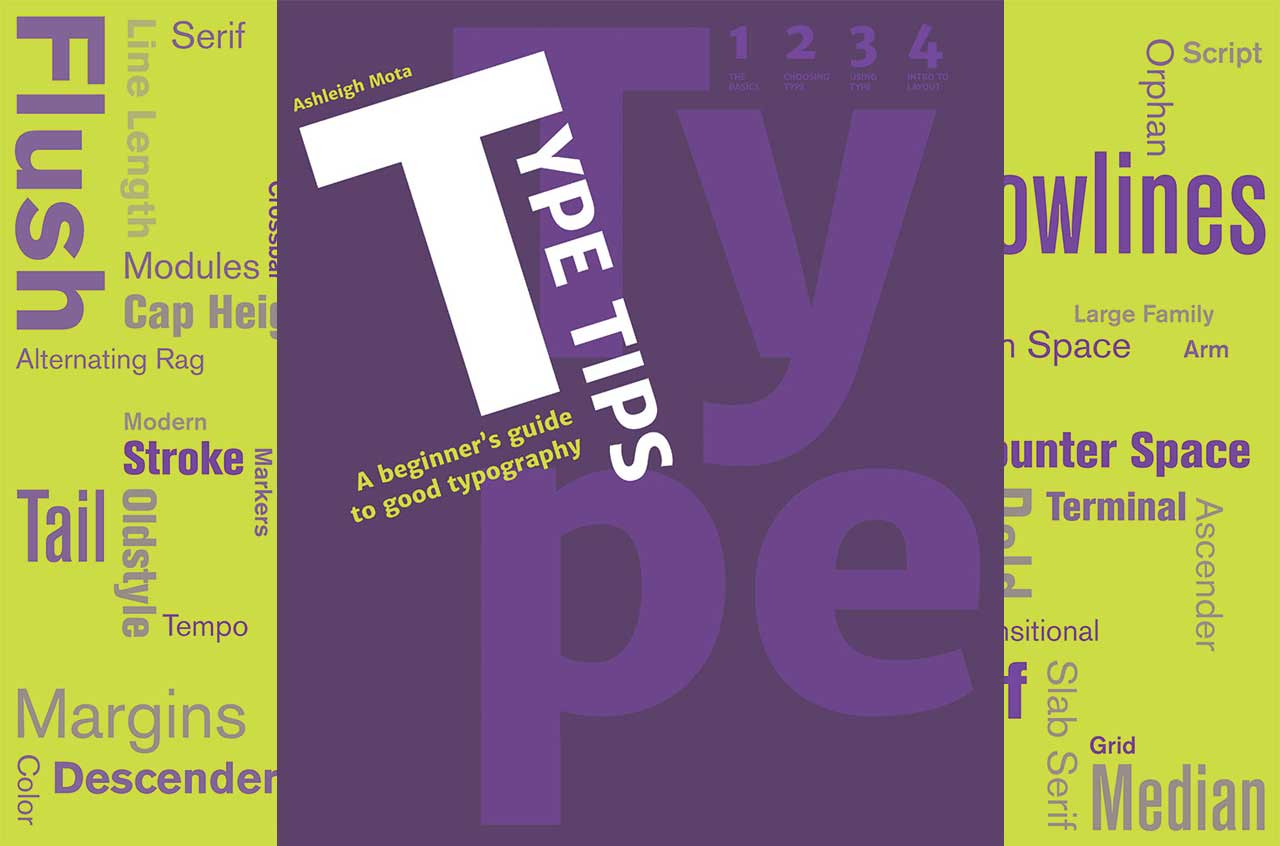
I used diagonals and scale to create visual interest. I listed the section titles, terms, and a quote for each section. I was getting close to where I needed to be visually. I tried this design in two color schemes and decided to go with the purple and green combination because I found it more visually pleasing. Also, I had used blue and orange so many times in my work already. Green and purple is a color scheme I’ve ever worked with before.
After this step, I tried to translate the language from the section title to my informational page spreads. This part wasn’t as easy. Sure, it looked more fun, but now I was bordering on overwhelming my audience. I was trying to fit too many things on the page, when I really had the freedom to use unlimited pages!
With the attempt, I was getting closer, but I had way too much information crammed on each page.
So it was like I made it to the other extreme: before there wasn’t enough visual interest and now I had way too much going on! In hindsight, I guess that’s how I found my happy medium. It’s better to have too much and simplify than to not have enough in the first place.
I had made good progress, but I still wasn’t satisfied. I decided to refine this first section before I moved on.
Breaking Ground
Over the next week, I finally made a breakthrough! My designs were received pretty well, with just some small things to fix. I presented the print version of section one in a pretty finished state with the beginning of section two.
There were just a couple of questions about making the language clearer to the audience, minor design issues, and some spelling and grammar errors. My professor also gave me another book to look at for visual examples to include in my font index.
Now that I had a system that worked, I was able to create pages a lot quicker and have confidence in what I was doing. The hard part was over. For the midterm critique, I planned on finishing sections one and two in print.
Personal Experience: Midterm Review
(Originally written Spring 2014) Today was my midterm review with Douglas Scott, the Creative Director at the WGBH Educational Foundation in Boston. As soon as it was my turn to present, I started shaking—I was so nervous! However, I tried to keep my composure as I handed Douglas Scott my artist statement.
So again, it was just a couple of things, nothing really major. Right off the bat, Mr. Scott asked what books I had looked at for inspiration. Mistakenly, I forgot to bring them (I had already filled four tables with spreads anyway!), but I did answer him and he gave me two more titles for further reading.
In section two, I had ordered my information so that the recommended typefaces were before the typeface categories. Mr. Scott thought that it would make more sense to put the typeface categories before the recommended typefaces. I agree.
Concerning the Typeface Index, it was suggested that I include some contemporary typefaces. The industry is constantly changing and the newest typeface I included was from 1990—twenty years ago! I’ll be doing some more research on contemporary faces and will add one or two newer typefaces.
My color scheme was well received, however, Mr. Scott wondered if my system could become even stronger by including one more color for subtitles to strengthen the system. That’s something else I will explore this week.
Other than those suggestions, the guest critic thought my work was well-considered and my system worked well. He said the pages were well-designed and the way I’ve ordered my information makes sense. That’s exactly what I wanted to hear! This situation proves that hard work pays off and I’m so happy with how far I’ve come in only half a semester.
A shot of what my space looked like for the midterm review.
When I thought my day couldn’t get any better, my friend Liz told me about two printing companies I could send my work out to to have printed for a reasonable price. I may have to adjust some of my page sizes to meet their predetermined standards, but it might be worth it.
Liz also told me about a feature in InDesign that optimizes pages for view on the iPad! This literally answered all my questions when it came to the interactive version! I believe with these features I can create a file that will display spreads in landscape mode and pages in portrait mode! That’s something else I’ll have to explore this week.
Smooth Sailing
From this point on, the design was set. It was now my job to discipline myself into getting these four sections laid out and finished with enough time to edit and make sure everything was perfect. My final book has four main sections: The Basics, Choosing Type, Using Type, and Intro to Layout. All together, with the introduction and appendix, my book ended up being around 150 pages long.
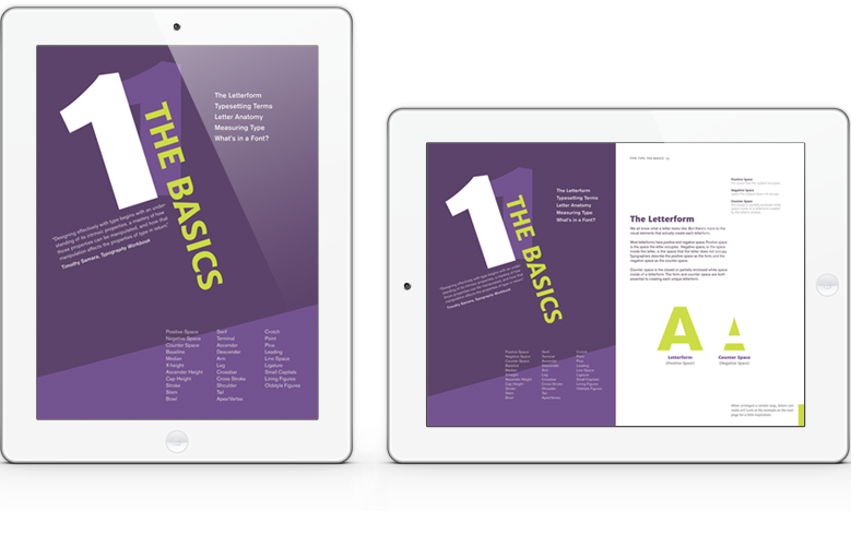
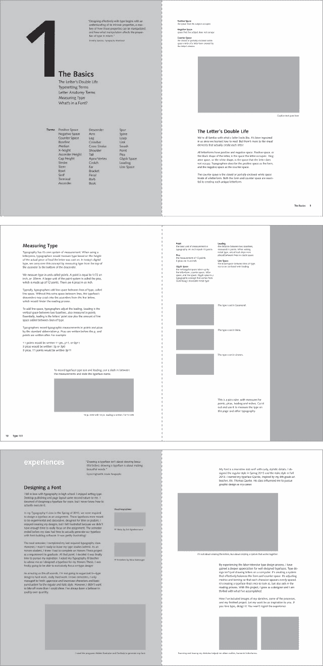
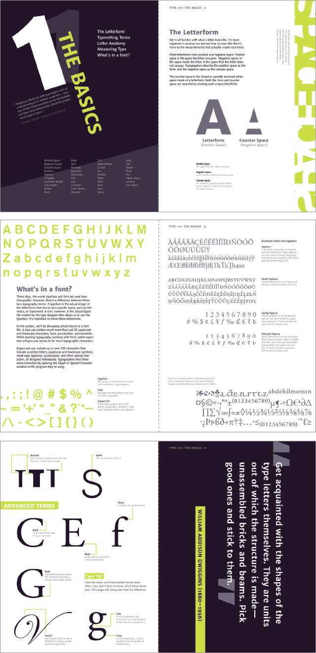
1: The Basics — The name is exactly what it implies: the first section of my book covers basic typographic concepts. I cover topics such as positive and negative space, basic terminology, measuring type, and what’s found in a font file. This section also has two exercises (called Try This!) that turn letterforms into a work of art.
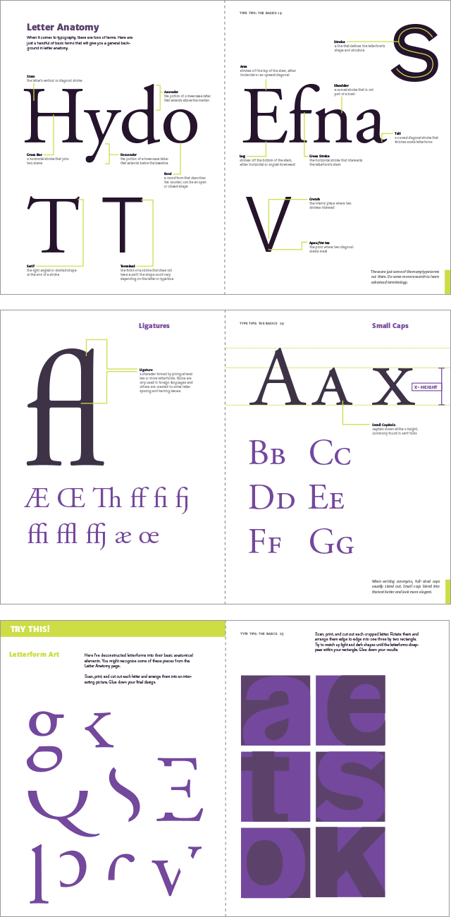
Spreads from Section 1: The Basics.
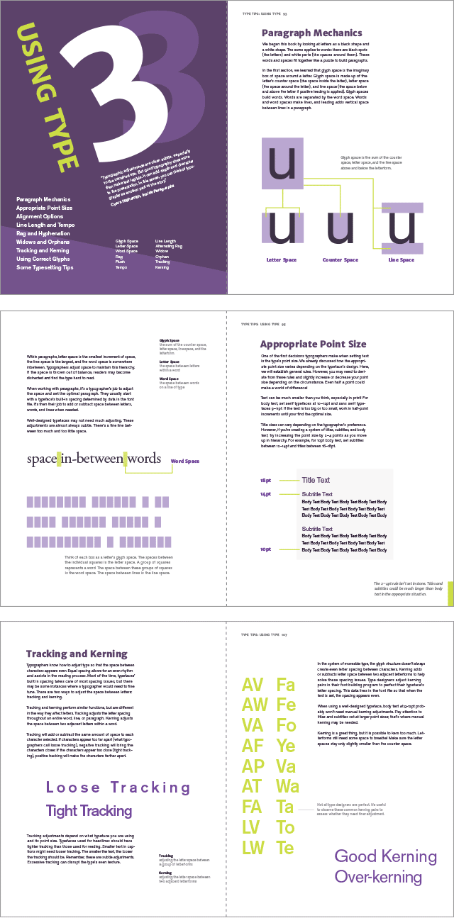
2: Choosing Type — This section focuses on choosing the right typeface for a particular document or project. This is one of the most critical skills when it comes to typography and it could make or break the message emitted by the text.
This section covers typeface categories, recommended typefaces, large type families, size, color, texture, and combining typefaces. There are also two Try This! Challenges: one involving color and texture and the other involving hierarchy.
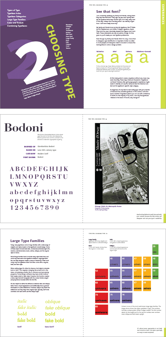
Spreads from Section 2: Choosing Type.
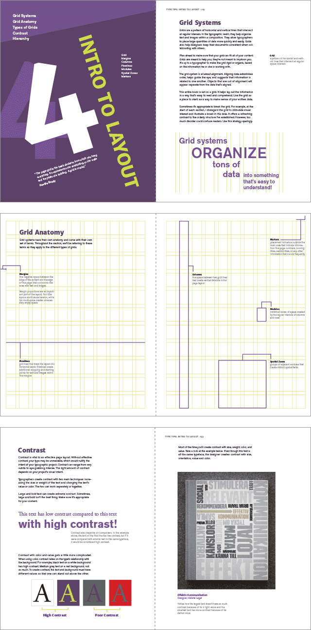
3: Using Type — After the first two foundational sections, readers then learn to put theories into practice. Section three teaches the audience how to properly set text in paragraphs.
Readers learn about paragraph mechanics, point size, alignment, line length, the rag, hyphenation, widows and orphans, and how to use correct glyphs. This section also features a Try This! Challenge about kerning and a worksheet where readers can “check off” good type techniques as they apply them in their documents.
Spreads from Section 3: Using Type.
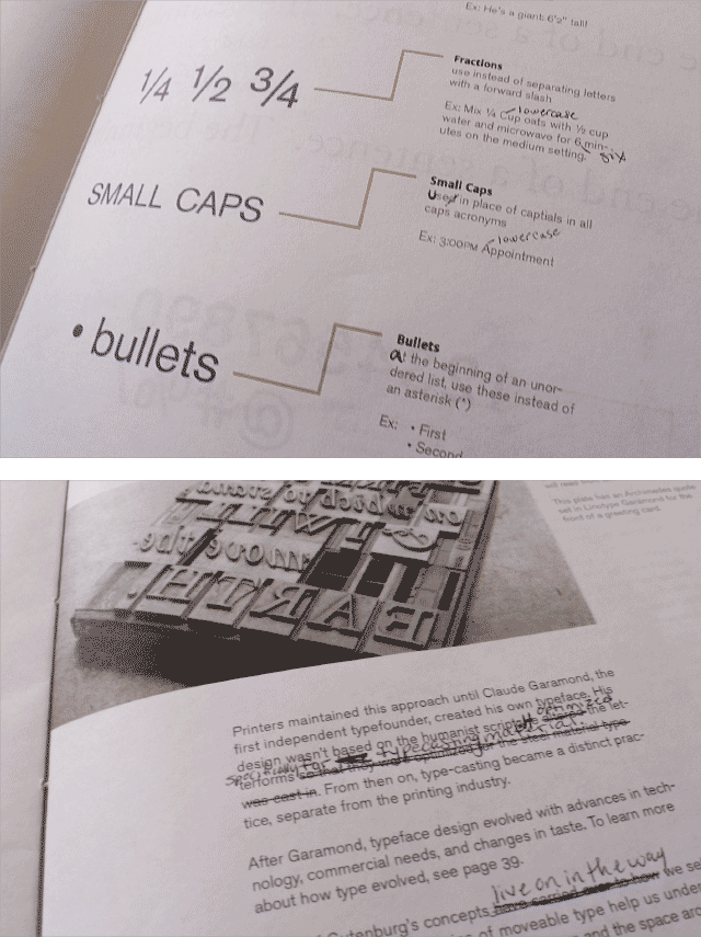
4: Intro to Layout — This section covers just the basics to page layout: the grid system, grid types, contrast, and hierarchy. This section alone could be it’s own book, so I didn’t want to go too far into detail, especially for beginners!
On the grid types pages, I actually created my own sample grid systems complete with matching grid lines. Then, in the Try This! Challenge, audiences have to decide which grid system is presented in an unmarked layout.
Spreads from Section 4: Intro to Layout.
Endsheet Design
The endsheet design is something else I spent a lot of time on. Endsheets are actually really important, as they’re the readers’ first impression when they open the book. I tried two different concepts, one working with the double T in my logotype and the other working with the terms I feature in the book that you can see at the top of this page. In the end, I found that the idea with the terms was much more interesting. I worked with different layouts until I settled on my final design.
Personal Experience: The First Draft of Type Tips
(Originally written Spring 2014) Spring break was so productive. As far as I’m concerned, I have a draft of every single piece I plan to have for the show! I made corrections to section three and put together section four and the Appendix, which has a complete glossary of the terms in the book, hints for the Try This! Challenges, resources, image references, a bibliography, and the colophon. The first draft is 135 pages of content, 145 with the appendix. I can’t wait to print it so I can see it in all it’s completion!
I also finally designed the cover! It’s pretty simple: my logotype with some subtle elements in the background that break down the sections in the book.
The most frustrating thing I probably did over break was figure out the color correction for my printer. The colors I picked print way too dark. What should be dark purple is black and what should be muted medium purple looks grey. After a ton of tweaking, I think I found something that works. I also added an intense purple to help solidify my color system.
My work done over break was well-received, thank goodness! There’s just a couple of small things to adjust. For next week, I have to start planning my process book. That was my next order of business anyway! I’m so happy I’ve been on track with my schedule. I’m also going to print and bind my entire book on cheap paper in signatures so that everything’s flippable. It’s all coming together! Now I can take a little breather and perfect everything.
Assembly
Editing Drafts
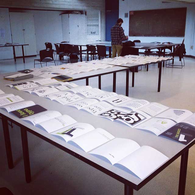
Editing is probably the most tedious part of the entire process, especially when the draft I had to edit was 150 pages long! This step took me a good three weeks. I printed and bound two draft copies: one for design edits and the second for copy edits. With the copy edit version, I also practiced how I planned to bind and add a cover to my final book.
Design edits involved fixing rags I missed, making sure my type sizes were consistent, reducing some point sizes, and adding light grey boxes behind text examples so that the audience doesn’t try to read it as part of the body text.
Copy edits were changes to spelling, grammar, awkward sentences and making sure page numbers were correct. It was scary to think that after four passes and having another person’s eye read it, that I was still finding things to fix! I’m pretty sure I fixed 99% of the errors before the deadline came for me to send it to print.
Some pencil markup during the copy editing process.
Anything I might have missed is probably not the end of the world. It came to the point where I was running out of time and I had to move on.
Printing Plans
After rounds and rounds of editing, I was also planning how I would print my book. I decided to have three copies for the exhibition: one hardcover version that I would print, trim, and bind myself and two softcovers printed commercially.
Sending the book out to print was probably the most nerve-wracking part of the entire project. I essentially have no control after it’s submitted. I won’t be able to proof the prints or check that color is right before it’s too late. This is exactly why I had to make at least one by hand, just in case a disaster happens with the others!
I practiced the process I will use for my final book with one of my editing copies. I sewed thirteen signatures together with coptic stitch binding so that the pages lay flat when it’s opened. Then, I printed a spine on smooth bristol, folded it and attached it to the book with dry adhesive.
For the covers, I printed the art on thin paper and wrapped it around two pieces of matte board. I then used permanent dry adhesive to attach the hardcovers to my book block. It sounds way easier than it is! This process usually takes me entire day because I have to be slow and careful.
Digital Version
The accompany my printed book, I also designed a digital version that is available as its own application in the Apple App Store. This version has larger text than the print version so that it can read comfortably on screen and also rotates from a one-page presentation in the portrait view to a two-page spread in the landscape view. Depending on the viewer’s preferred reading style, they can use either format.
In the future, I may explore the idea of using hyperlinks for the page references and table of contents page. That would involve fitting another type style into my system that would make people want to tap the text.
Exhibition Space
For the Senior Design Exhibition, we were also required to design our exhibit space and develop takeaways for those who visit the show. In my setup, I wanted my book to shine. The three copies of my book were placed on a table in my display.
To draw visitors to my space, I hung three posters. The main poster, 24 by 36 inches, has the phrase “I love type” in large, bold letters. I then use imagery from the first section: The Basics, to label the baseline, median, ascender height, and cap height. At the bottom, I have my logo and information about purchasing the e-book version. My other two posters, 18 by 24 inches, have typographic layouts of the terms I cover.
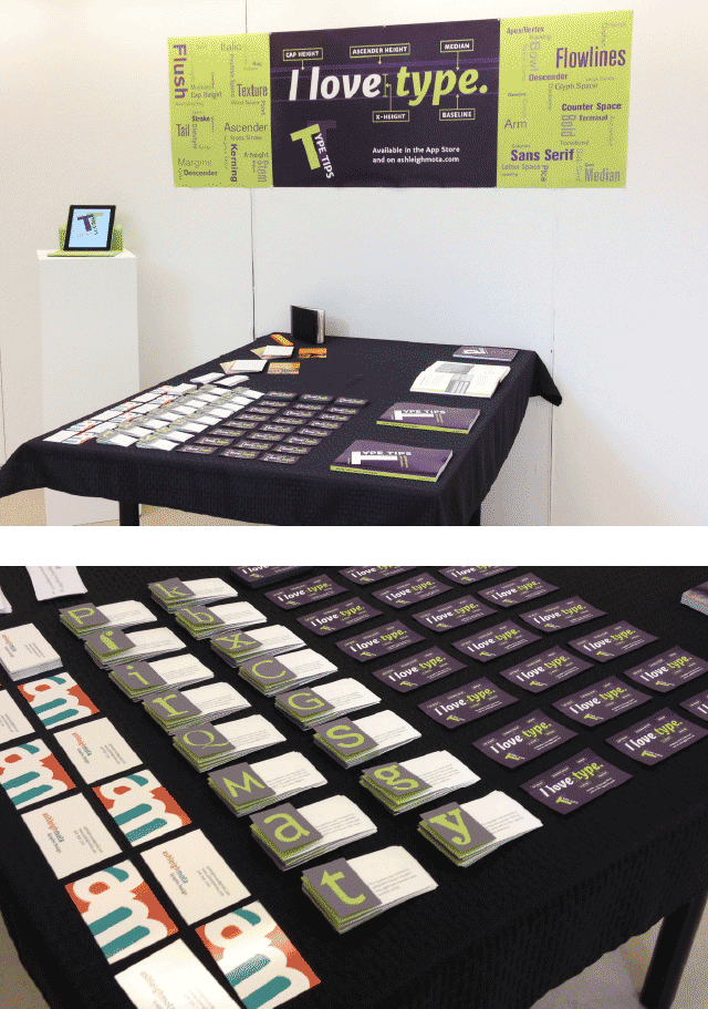
My exhibition space.
At the exhibit, I had two takeaways. One is a magnet with the same design as my large poster. The other takeaways are little foldable papers that have introductory information about the fonts I feature in section two. Keeping my audience in mind, I wanted these papers to give users information, but not bombard them with overwhelming facts. I kept the information simple and minimal, just enough to spark interest.
Final Thoughts
This project was tough. It was time-consuming. It took over my life. But it was so worth it. Never did I ever think I could write, design, and produce a 150-page book in five months, especially one I would be proud of!
Over time, I’ll probably find things I would like to change or even discover some little mistakes on a page or two, but that’s all a part of the learning process. With the time I had, I did the best I could do and down the road, I could always rerelease new editions of the e-book!
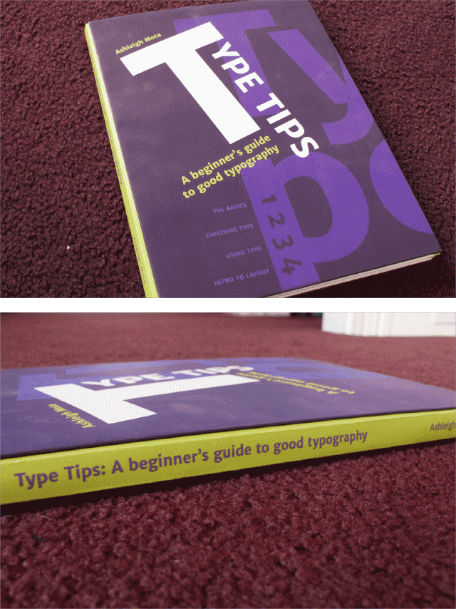
Final printed book.
This project challenged me, it helped me push my own limits, and it helped me finish my undergraduate career working on something I’m passionate about. The skills I’ve learned at UMass Dartmouth are reflected in the book’s design and I’m sure that it’s my strongest portfolio piece of my college career.