
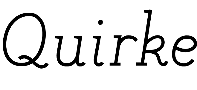

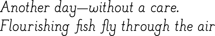

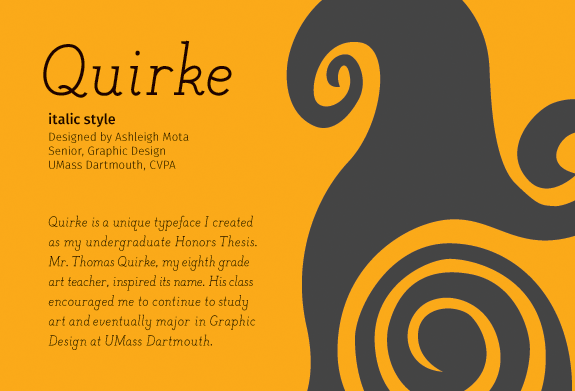
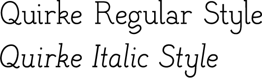
Quirke is a typeface family I designed as part of my college honors thesis. Quirke is a stylistic slab serif taking inspiration from the fonts FF Meta and FF Ernestine to combine strong slab serifs with unusual strokes and a little personality! My goal was to create a feminine and friendly slab serif font to be used in playful and creative contexts. There are two styles available to download for free: regular and italic.
The name for Quirke, though it matches this font’s quirky appearance, is an ode to my 8th grade art teacher, Mr. Thomas Quirk, who encouraged me to explore art as my career, which led me to choose Media Technology as my shop at GNB Regional Vocational Technical High School and eventually major in graphic design at UMass Dartmouth.
Quirke in use
Center Stage Dance Studio 14th Annual Recital T-Shirt
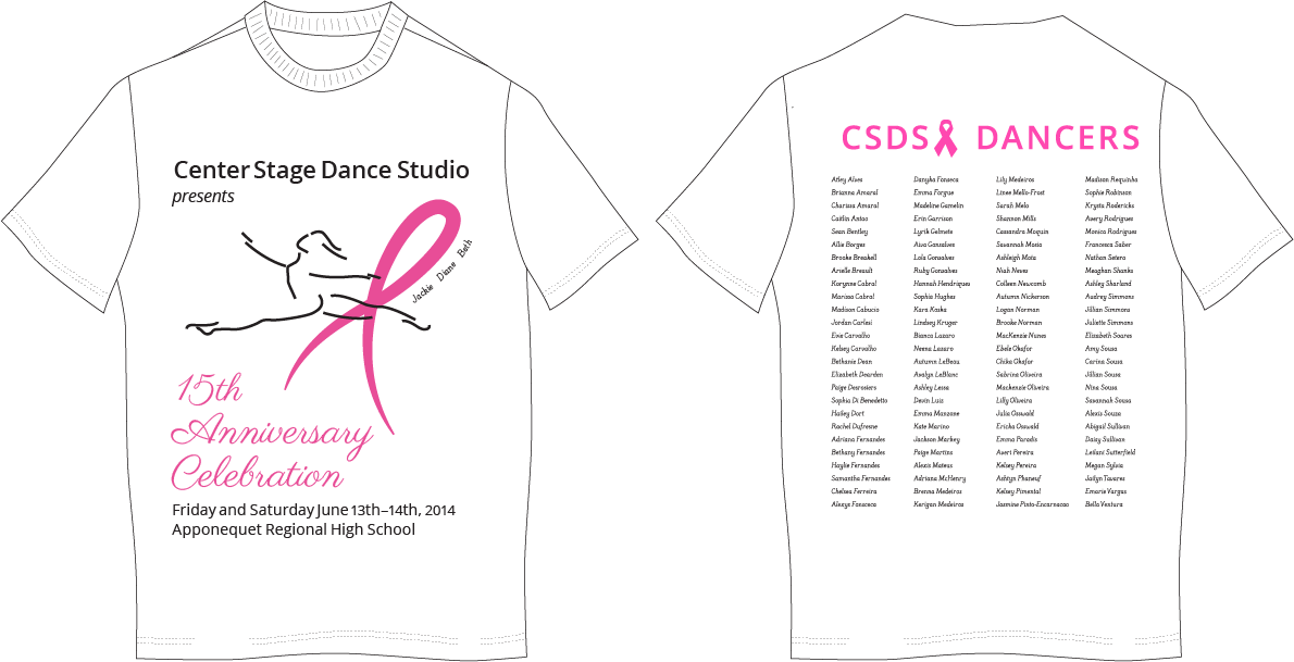
Since early in the 2010s, I have been designing the Center Stage Dance Studio recital T-Shirt. The theme for the 15th Anniversary Recital was Breast Cancer Awareness and the fellow dancers we lost to breast cancer. This t-shirt design was a great opportunity to use the delicacy of Quirke Italic. The font was featured with the three names near the ribbon on the front of the design and with all the featured dancers on the back of the design. This shirt was purchased and worn by students participating in the recital that year.
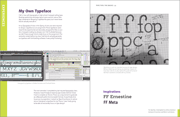
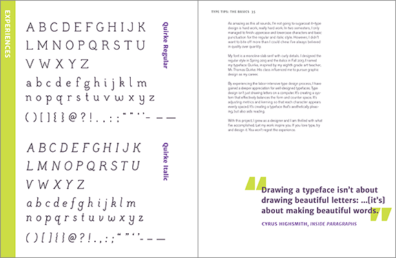
Type Tips feature: My Own Typeface
For my Senior Degree Project, a book called Type Tips: a Beginner’s Guide to Good Typography, I dedicated a feature section about designing Quirke. These spreads cover the type design process and reflects on how much work goes into creating one typeface. Visit my Type Tips post for more information!
Quirke Cards: Regular and Italic
I created these postcards to accompany my Designing Quirke Process Book for the Honors Thesis Poster Presentation in May 2014 at UMass Dartmouth. Visitors will be able to take a postcard with them to remember my project. The front showcases a motif I designed in Thomas Quirk’s eighth grade art class about positive and negative space and all of the font’s characters appear on the back.


Generative Art
I completed this piece as a project in Interactive Design with Shawn Towne in Fall 2013. For this piece, we were required to write the code for a composition that continuously regenerates and builds upon itself over time. I then exported this piece as frames and compiled them into a video with accompanying music.
Letterforms from Quirke Regular flash in a grid-like pattern, regenerating random letterforms from the 26-character lowercase alphabet. In the background, rounded rectangles draw and redraw themselves randomly and fade away over time.
My professor, Shawn Towne used Quirke Regular for titles in this compilation of Interactive Design work from 2012 and 2013. This video appeared at the 21st Annual Digital Media Festival at UMass Dartmouth in November 2013. My generative art piece also appears in this compilation.
The Process
Quirke is a unique typeface that I created for my Honors Thesis at the University of Massachusetts, Dartmouth. Over the span of two semesters, I designed the uppercase, lowercase, and punctuation characters for the regular and italic styles. This typeface is intended for onscreen viewing and could also appear in print.
My eighth grade art teacher, Mr. Thomas Quirk, inspired the name of this typeface. I consider him to be my first important artistic mentor, who encouraged me to pursue art as something more than a hobby. His class encouraged me to study art further and eventually major in Graphic Design at UMass Dartmouth.
The first step in creating Quirke involved exploring possible design avenues for my letterforms. I sketched numerous versions of the nonsense word, “fop,” which incorporates various parts of letters. The sketch I chose would inform my design decisions as I developed vectorized characters later on.
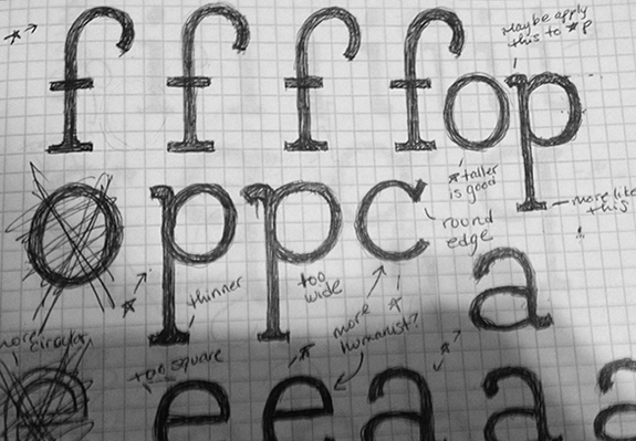
Some of my rough sketches of ‘fop’ while approaching a design avenue.
After this exercise, I chose to further develop a thin, humanist slab-serif style. I was especially inspired by the way the top of the lowercase ‘f’ had a slightly exaggerated lean, which brought character to the overall type design.
Using my “fop” design as a guide, I spent the next several weeks designing my lowercase letters, working with about five letters at a time, sketching, evaluating, and creating vector art in Adobe Illustrator. I used the same technique to design the uppercase and special characters later on in the semester.
Sketching is an essential part of the design process. It’s important to explore with the freedom of pen and paper because it allows for a more gestural approach that could be refined on the computer. Rarely could one capture the same gestural feel using only the computer.
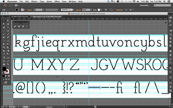
In Adobe Illustrator, I had to make sure every letter matched a height of 1000 pixels to prepare the vectors for the next steps in FontLab.
After the vectors were fully developed, aligned, and scaled to match their height, the next step is to import my designs into type design software called FontLab. This program has the tools to adjust the letter spacing and also the space between two individual characters, called kerning. This is a time consuming and tedious process, which took about two weeks to accomplish.
Spacing and kerning is important. A font with even spacing and kerning enhances readability and allows the font design to shine.
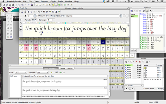
Here’s a look at the kerning workflow in FontLab. There were many steps and lots of panels to work with, but the process was definitely worth it!
For the second half of my thesis project, I designed a variation of my regular style: Quirke Italic. Well-designed italics aren’t simply the letters slanted on an angle. Designing italics involves adding stylized details appropriately to the established characters so that they keep the aesthetics of the regular style, but have enough distinction to help them stand alone.
Another aspect to consider involves the width of the italic characters. Typically, italics are narrower than the regular style because they were originally developed for economy so that more words could fit on a line. To follow conventions, I made my italic characters slightly narrower than the regular style.
To complete Quirke Italic, I followed the same process I used to create the regular style, from “fop” sketches to letter spacing and kerning in FontLab. It’s interesting to compare the regular and italic style and see how the fonts work with each other. I believe that I’ve succeeded in creating the beginnings of a type family that I could
expand in the future.
By completing this project, I learned the basics of type design and how to create a successful typeface. I’ve also created a strong portfolio piece that showcases what I love. This kind of work is definitely something I plan on pursuing in my future career.
I would like to extend a special thank you to my advisor, Professor Laura Franz and committee member Professor Michelle Bowers, who guided me and provided helpful feedback throughout this entire process. Their knowledge and resources helped me to succeed in creating this typeface and meeting my goals.